
i started with this kind of style for my double page spread because I really like the idea of having a block of pictures down at the bottom. unfortunately my interview does not fit on the page properly and I have had to result to making an extra page which is below:
 This is as far as i got in creating the second page for my interview. I am not entirely sure about it yet and of course, there are things that I will ammend and change.
  This next screenshot is of my doublepage spread that I have yet again adapted. i decided that I wanted all of my interview to fot onto one page, so I moved the main photo over and also minimised the pictures in the boxes in the hope that I could fit all of the interview on. I have also changed the pink interviewer typo to grey because I liked how the green stood out quite a lot.
 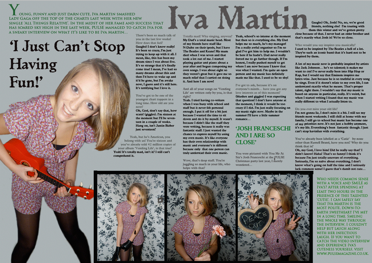 This time I changed the layout slightly, swtiching the pictures from one side to the other. I think it looks better like this because the interview looks neater. I like to think that this is more or less finished but there are still some things I can add to it.
No comments:
Post a Comment