Charlotte Annie Coe
5027
Wilmington Grammar School for Girls
61119

 This is as far as i got in creating the second page for my interview. I am not entirely sure about it yet and of course, there are things that I will ammend and change.
  This next screenshot is of my doublepage spread that I have yet again adapted. i decided that I wanted all of my interview to fot onto one page, so I moved the main photo over and also minimised the pictures in the boxes in the hope that I could fit all of the interview on. I have also changed the pink interviewer typo to grey because I liked how the green stood out quite a lot.
 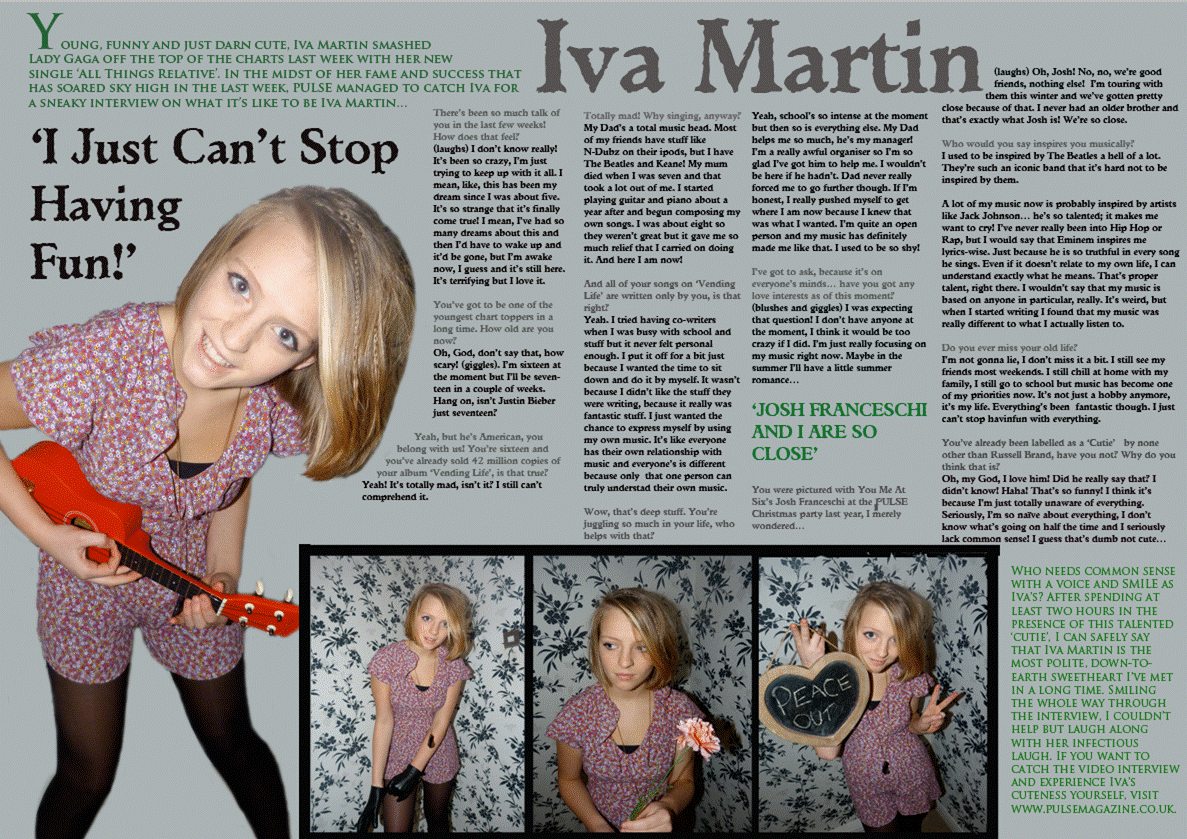 This time I changed the layout slightly, swtiching the pictures from one side to the other. I think it looks better like this because the interview looks neater. I like to think that this is more or less finished but there are still some things I can add to it.

 This double page spread to the right is one of my favourites in my research. I love the way the title is set out, for it is in accorance with the picture because of the model's dark hair. I also like how there a hints of red in and around the text, clearly linking the picture to the text.,
  Like the first one, this page is quite boxy. However, I do like how this double page spread uses the picture in accorance with the title, like the one before. The title is very eye-catching and when I create my double-page spread, I hope to be able to do the same thing. On this one and the one before, they both share the feature of having the first letter of the text as a capital. I love this idea, for it signals the start of the text and also makes it more interesting.
  This last double-page spread that I looked at is much more rocky than the other three. I love how this double-page spread is set out, with the black and white pictures, the column on the right breaks up the text a bit and the title is extremely eye-catching. By making 'THE BEST MCR' in white a bigger than the rest of the title, it inrigues the reader to read on to the actual text. The colours are all consecutive, which is what I will aim for also.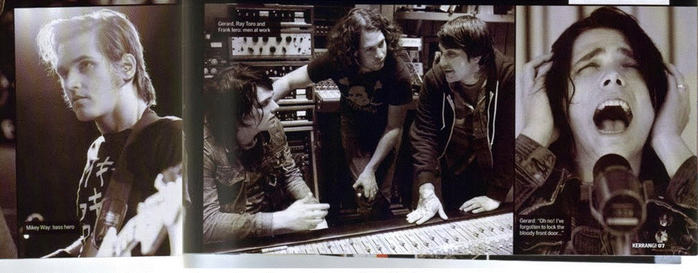


 This is the busiest I have managed to get my fron cover. I like the continuity of colour and I have also decided to change the font and colour of 'IVA' because it is much more bold as of this one. I have yet to put on more information but I really think this draft is one of my best. The one above is a continued version of the one to the left. This is the best draft I have come up with, I think, and I'm very likely to keep this one.


 This picture above is a good one because it is quite personal to the reader. They would see the hand reaching out and feel as if the artist is directly addressing them. It is a fun picture, allowing the artist and the reader to be light hearted. The photo to the right is a little more serious, like some of my research on photographs. This will probably be used on my contents page or double page spread. The two pictures below also show light heartedness like the one above. I love the angle of the one on the left. Her facial expression shows lightheartness, fun and laughter. I think this could be good with the idea of innocence. The picture below on the right is also a bit of fun whilst also being quite aggresive. I will definitely use this picture on the double page spread.


 Another potential front cover picture
 This contents page for kerrang, in my opinion is quite effective. It is obviously packed with information, complete with photographs of the bands being mentioned. Also, there is an evident colour scheme of yellow
  which runs throughout the contents page. The is also an evident if slightly off centre example of having the contents page in thirds. I really like this layout.
  This contents page is on of the best in my opinion. Any paramore fan would know that 'riot' is the name of their second album. Already, this appeals to Paramore's fans. If I am right in thinking, this edition of this magazine is entirely dedicated to paramore. The layout is not too messy, it is clear to read and there is an obvious connection of red again. The labels claiming what else is to come in the magazine gives the reader more of an idea of what is to come and also making them want to read on. I'd like to use something catchy like the 'its a riot' on this contents page for my own contents page.


 This one is a personal favourite of mine. I like the way Hayley Williams is the central picture and also how it is quite direct to fans, because it is quite personal. Any fans of paramore would see this and want to read it.
  Although this picture is actually of the band, I love how direct and focused this picture is. It is as though she is reaching out to the reader.
  |


 This picture here is one of my favourites of Pink. The green leggins contrast to the black leather jacket and white hair. The microphone also shows us that singing and performing is her proffession. The snarling smile on her face also shows what kind of music she sings.
 This is my first design for the front cover of my magazine. The subheadings are eye catching and it is colourful, but I believe that this will not be my final draft for my front cover. This designs colours do not correspond very well with each other and I will probably try and get the colours to compliment each other. The colours in the picture defnitely do not correspond at all and i will try to do that.
  I have changed the colour of the headline to black because I think it looks more striking and corresponds with the colours in the picture. I have not changed much apart from that. I have started my first draft of the contents page, shown next to the cover draft. I plan to put pictures down the left side of the page to fill up the page but this is subject to change.
  i have once again changed some aspects of the front cover. This is as far as I have got in developing the front cover and the contents page. the colours on the front cover are much more corresepondent with the colours in the picture and in the title of the magazine. on my contents page, the third rule is apparent. I plan to put little pictures in the middle third that can be seen as quite empty at the moment. the colours on the contents are correspondent and coherent with the colours on the front cover. Evidently, this is my favourite design yet, although there are still some things to be developed on both pages. I am unsure whether to put a box around the 'Ivy Danvers' part on the front page.

